
The Format of The Small Shop
Paris is perhaps still the best city in which to celebrate the small shop. I was thinking cursorily of Walther Benjamin’s Arcades, and the wonderful film of all the inhabitants of Rue Daguerre in Agnes Varda’s Daguerréotypes, and was thrown back to Coracle Press’ two shops in the Camberwell New Road in South London in the nineteen seventies and eighties. At the same time there was a parallel and almost identical shop front to Coracle in Clapham Junction, tall and narrow with wooden wall covering, and steps rising to a small mezzanine behind the front display space. They were both encasements for specific objects designated for attention. There was a time when publishers shops existed, often clustered in an area, much in the same way that rubber-stamp shops were found together, and still do to some extent in Amsterdam. In Paris, if I remember correctly these stamp shops were gathered in Rue Montorgueil, but no longer. I guess in current fashion, it continues with art galleries, whatever they have become in their lack of specificity.
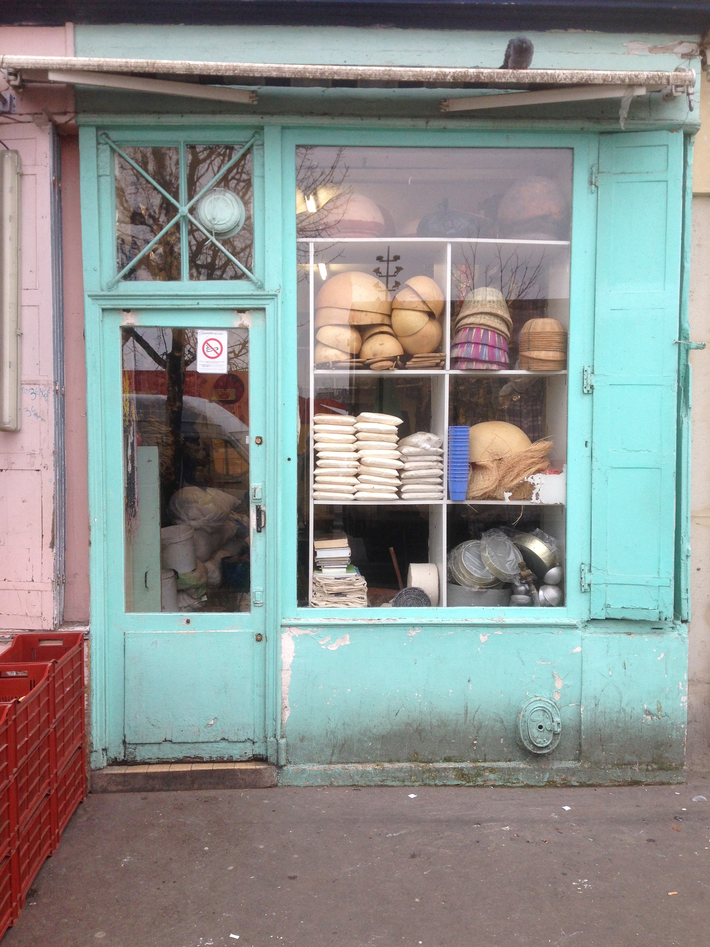
It was passing Editions Tirésias in Rue Letort on the first of the walks in from the Portes de Paris, that suggested a relationship between the format of a shop and the format of a book cover.The contents of the Tirésias books are rather idiosyncratic and even furtive, and deal with resistance and deportation during the second world war. I know poetry and some books by artists can be pretty obscure, but some of these must take the prize! But the full plain-ness of their shop and that of some of their book covers has a unique correspondence
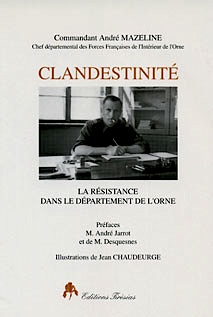
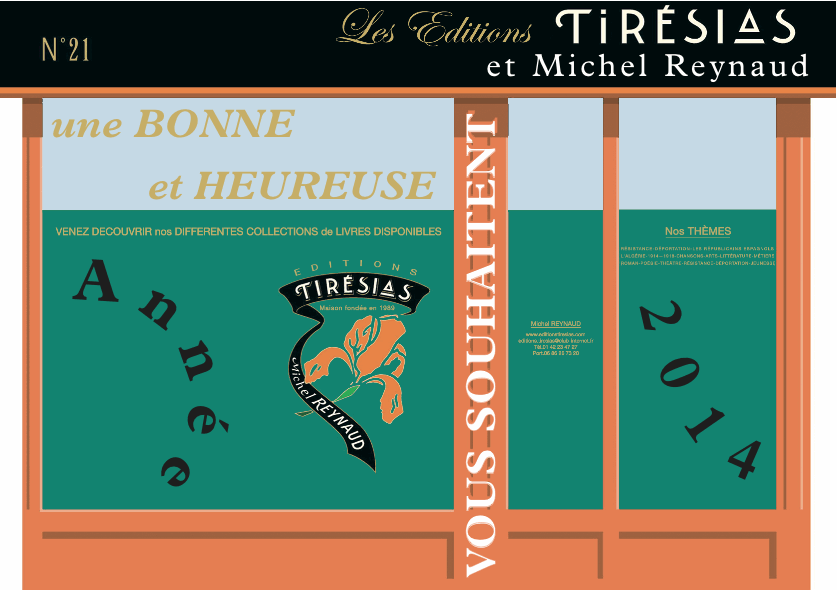
After I purchased a few books from Tirésias as examples of the idea, rather than with the engagement of their subjects (although who could not be appealed to by a title like that above of Clandestinity ), they sent me a New Year’s Card in the format of their shop
When I think back, such relationships existed with Coracle. We were always playing with the presence of the front of the building, as a format, as a referent to the book cover and other bits of ephemera which we thought just as important.SC
